Lee's Blog - GDD 110
Thursday, November 14, 2013
Wk12 Upgraded Project Research
The animated title screen was one of my favorite projects, and I think mine came out pretty good. I'd like to improve upon it even further by giving it a redesign. I think it needs to convey the idea behind my game a little bit better. Professor Nersesian suggested that I try to animate the buttons on the controller, and this is one thing that I will definitely take into consideration when I begin to experiment with it in Photoshop. I also may draw inspiration from title screens of classic arcade games such as Pac-Man and Donkey Kong. These title screens were really eye-catching and had a lot of different animations going on the screen, and I think my title screen would benefit from having these attributes as well.
Thursday, November 7, 2013
Wk12 Maze Texturing Research
My maze is located inside a haunted mansion, so what better game is there to draw inspiration from than Luigi's Mansion? I used a creepy-looking pattern for the wallpaper on the walls of my maze, but it does not really scream "haunted mansion" as much as it should. I think if I use a wallpaper texture that is similar to the ones in these screenshots, my maze will be closer to my original vision.
Tuesday, October 29, 2013
Thursday, October 24, 2013
Wk09 Maze Concept Phase
My maze will not be based on my previous game; it is a new idea in a different setting. The maze will be inside a haunted mansion of sorts. I am aiming for a regal, Victorian mansion-esque look. The color scheme will consist of mostly dark colors, such as dark shades of purple, grey, and black. The floor will be marble, and the walls of the maze will have fancy wallpaper. The ceiling will be cracked and old-looking.
Floor references:
Wall references:
Ceiling references:
Thursday, October 17, 2013
Wk07 Game Prop Final Phase
This is my final game prop pixel art. Unfortunately I ran into some technical issues with the computer I was using, so this did not turn out as well as I had hoped it would.
Tuesday, October 15, 2013
Wk07 Game Prop Concept Phase
My game does not have any specific props, so I decided to do a barrel because it was the first thing I thought of.
Thursday, October 3, 2013
Wk06 Logo Design Concept Phase
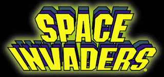
I researched a few images that I feel represent my game in some way. The title of my game is "Gamepad Attack", and I think what type of font I use for the logo will be very important because it needs to convey both the main idea and tone of the game. I like the logo for the classic arcade game Space Invaders because the font itself conveys a striking sense of urgency. The glowing, bright yellow text is somewhat alarming and fits the alien invasion theme of the game very well.
I am also a fan of the logo for the Nintendo GameCube. The font looks really cool, and I especially like how an image of the GameCube itself is incorporated into the logo. My game revolves entirely around the controller (or gamepad), so I will definitely try to make that clear with my logo.
Subscribe to:
Comments (Atom)


