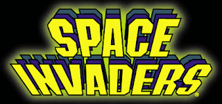
I researched a few images that I feel represent my game in some way. The title of my game is "Gamepad Attack", and I think what type of font I use for the logo will be very important because it needs to convey both the main idea and tone of the game. I like the logo for the classic arcade game Space Invaders because the font itself conveys a striking sense of urgency. The glowing, bright yellow text is somewhat alarming and fits the alien invasion theme of the game very well.
I am also a fan of the logo for the Nintendo GameCube. The font looks really cool, and I especially like how an image of the GameCube itself is incorporated into the logo. My game revolves entirely around the controller (or gamepad), so I will definitely try to make that clear with my logo.


you are missing the final phase posting of this project. also please turn off the word verification on your blog. see me if you need help to do this.
ReplyDelete