
Thursday, November 14, 2013
Wk12 Upgraded Project Research
Thursday, November 7, 2013
Wk12 Maze Texturing Research


My maze is located inside a haunted mansion, so what better game is there to draw inspiration from than Luigi's Mansion? I used a creepy-looking pattern for the wallpaper on the walls of my maze, but it does not really scream "haunted mansion" as much as it should. I think if I use a wallpaper texture that is similar to the ones in these screenshots, my maze will be closer to my original vision.
Tuesday, October 29, 2013

Thursday, October 24, 2013
Wk09 Maze Concept Phase
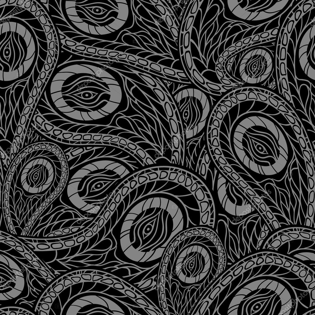
My maze will not be based on my previous game; it is a new idea in a different setting. The maze will be inside a haunted mansion of sorts. I am aiming for a regal, Victorian mansion-esque look. The color scheme will consist of mostly dark colors, such as dark shades of purple, grey, and black. The floor will be marble, and the walls of the maze will have fancy wallpaper. The ceiling will be cracked and old-looking.


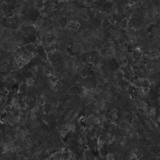


Floor references:


Wall references:
Ceiling references:

Thursday, October 17, 2013
Wk07 Game Prop Final Phase
This is my final game prop pixel art. Unfortunately I ran into some technical issues with the computer I was using, so this did not turn out as well as I had hoped it would.
Tuesday, October 15, 2013
Wk07 Game Prop Concept Phase
My game does not have any specific props, so I decided to do a barrel because it was the first thing I thought of.

Thursday, October 3, 2013
Wk06 Logo Design Concept Phase


I researched a few images that I feel represent my game in some way. The title of my game is "Gamepad Attack", and I think what type of font I use for the logo will be very important because it needs to convey both the main idea and tone of the game. I like the logo for the classic arcade game Space Invaders because the font itself conveys a striking sense of urgency. The glowing, bright yellow text is somewhat alarming and fits the alien invasion theme of the game very well.
I am also a fan of the logo for the Nintendo GameCube. The font looks really cool, and I especially like how an image of the GameCube itself is incorporated into the logo. My game revolves entirely around the controller (or gamepad), so I will definitely try to make that clear with my logo.

Tuesday, October 1, 2013

Thursday, September 26, 2013
Wk05 Title Screen Concept Phase

This is my title screen concept. I kept it simple, as you can tell. This was inspired by Galaga's title screen. I like the way the stars twinkle in the background of Galaga's title screen, and I think that would look good in my title screen as well. I may also try to animate some enemies and make them move around the screen. Below is a video of Galaga's title screen to give you an idea of what I'm shooting for.
Tuesday, September 24, 2013
Wk04 Mood Board Final Phase
The thing about my game is that no two levels will be the same, so it is difficult to make a mood board for it that applies to the whole game.


I created a couple possible alternate levels, with different backgrounds and mood boards. Each level's mood board can be completely different from another's, but each individual level has its own set of colors. The primary colors in the second picture, green, blue, and black, go together very well and aren't too flashy. For each level there will be about three or four colors used, with different shades of each color to help blend everything together nicely and make it visually appealing.
Thursday, September 19, 2013
Wk04 Mood Board Concept Phase


As you can see, my concept art looks a lot like the Super Mario Galaxy artwork above. However, the colors I used here are quite a bit darker, not just in the literal sense, but also in the sense that they convey a more serious tone. I'm not sure yet if I want to stick to this serious tone, or try to lighten the mood a bit by using brighter colors. One thing I am happy with in this artwork is the bright green enemies. They stand out against the dark background, making them easy to spot and destroy, but now that I think about it, that may make the game a bit too easy. Perhaps changing their color to one that blends in with the controller or the background would be more challenging.
Tuesday, September 17, 2013
Wk03 Game Pitch Final Phase
Introduction
My game is an abstract, arcade-type game which involves a virtual controller that can be manipulated by the identical controller that the player is holding in his/her hands. The platform I had in mind when designing this concept was the PlayStation 4 because of its controller, the DualShock 4, but theoretically the game could also work well on the Wii U and PlayStation 3.


In this game, there is no story or main character to speak of. On the screen there is a 3D model of the controller, which, depending on the level, can also become several different things (such as a spaceship) but it always retains the general look of the controller. The object of the game is to prevent swarms of tiny enemies from destroying your (Ex.) "Spaceship" by rotating your controller to find them and then pressing and releasing the appropriate button with the correct timing to "fling" the enemy off.
Gameplay
One example of a possible level would be that your controller is a spaceship, and the enemies (I'll call them "bugs"), are crawling all over the on-screen, 3D-modeled controller and attempt to "eat" away at its buttons in order to get inside. On the screen, all of the buttons are outlined. The face buttons of the controller become outlined in red when an enemy is trying to do damage. Flinging enemies is not as simple as tapping the button, however; to successfully fling an enemy off of a button, the button must be held down for approximately 1 second to “wind it up”, then it must be released rapidly, in a “flicking” manner.

The motion detection technology inside of both the DualShock 3/4 and Wii U GamePad will allow the player to directly and freely rotate the on-screen controller in order to see whether there are bugs on the back of the controller or on the shoulder buttons/triggers.

The motion detection technology inside of both the DualShock 3/4 and Wii U GamePad will allow the player to directly and freely rotate the on-screen controller in order to see whether there are bugs on the back of the controller or on the shoulder buttons/triggers.
When bugs are around the outer edges of either of the two analog sticks, the sticks must be rotated around to "squash" the bugs. If a bug gets inside of the ring surrounding an analog stick, the stick must be clicked to squash the bug trying to get inside.
If the player feels overwhelmed by enemies, once and only once can he/she shake the controller to immediately clear the spaceship of enemies.
If the bugs eat away at a button enough form a hole and one of them gets inside, it will begin to move around rapidly inside the controller, doing damage to the internals of the "spaceship". (The advanced rumble technology of the PS4's DualShock 4 controller will likely cause to player to feel as if there really is something inside of the controller he/she is holding.) This will cause the player's health bar to begin to drop. As more bugs get inside of the spaceship, the faster the player's health decreases. When the player's health reaches zero, it is game over. The player can then enter their initials if they got a high score, as well as view the scores of others from around the world.
Other Details
This game would definitely not be a retail release, because it is a very simple and experimental game. It would be an inexpensive, downloadable game. On the PS3 and PS4, the game would have stereoscopic 3D support, for added immersion.
Thursday, September 12, 2013
Wk03 Game Pitch Concept Phase
One of the concepts I've been thinking about involves putting the controller that the player is holding into the game, as a virtual object. I've seen examples of this in LittleBigPlanet and the Skydiving game in Wii Sports Resort.

Tuesday, September 10, 2013
Wk02 Rock, Paper, Scissors Final Phase

Thursday, September 5, 2013
Wk02 Rock, Paper, Scissors Concept Phase
I tried to make each of these ten thumbnails unique. I think for the most part, I was successful. My favorite one is probably number three, because even as a concept, it looks like it could be an effective way to inform someone about the game. I also like how number one came out; it looks very clean and straightforward compared to most of the other, more experimental thumbnails. I will most likely not use number eight because it is all over the place and it is difficult to follow.


 I chose these four pictures because each of them can help show how to play Rock, Paper, Scissors. By including these pictures along with my written instructions on how to play, it should be very easy for anyone to learn. I also think that by having two cartoon pictures and two pictures of real-life hands and objects, it will give the poster a balanced look.


Subscribe to:
Comments (Atom)